Appearance
The Appearance tab controls the visual presentation of the consent dialog: position, animation, the inline placeholder size, color theme, and dark mode behavior. It is organized into sub-fieldsets — Layout, Theme, and Custom Colors (Light and Dark).
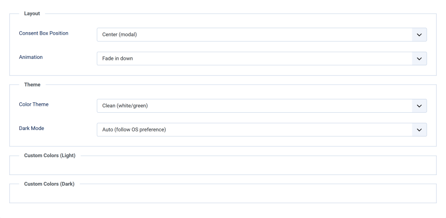
Layout
Consent Box Position
| Option | Value | Description |
|---|---|---|
| Center (modal) | 1 | Centered overlay with semi-transparent backdrop. Max width 500px. (default) |
| Bottom bar (full width) | 2 | Full-width bar fixed to the bottom of the viewport. |
| Bottom right | 3 | Card fixed to the bottom-right corner. Max width 400px. |
| Bottom left | 4 | Card fixed to the bottom-left corner. Max width 400px. |
| Inline (replace map) | 5 | Replaces each detected map in place with a consent placeholder card. |
See Positions & Animations for visual details and responsive behavior.
Scope: This setting controls how auto-detected maps are blocked.
{smartmap}shortcode embeds always render as an inline placeholder where the map sits, regardless of the position you choose here — see Where each position applies.
Inline Placeholder Size
These fields appear only when Consent Box Position is set to Inline (replace map):
| Field | Type | Default | Range |
|---|---|---|---|
| Placeholder Width (%) | Number | 100 | 10–100 |
| Placeholder Height (px) | Number | 400 | 100–1000 |
Set these to match your map's dimensions so the placeholder keeps the same layout footprint.
Animation
The Animation field applies to the floating positions (1–4) only and is hidden for the inline position:
| Option | Description |
|---|---|
| Fade in down | Slides in from above (default) |
| Fade in up | Slides in from below |
| Fade in left | Slides in from the left |
| Fade in right | Slides in from the right |
All animations respect the prefers-reduced-motion media query. When a visitor has reduced motion enabled, the consent box appears instantly.
Theme
Color Theme
| Theme | Light Colors | Description |
|---|---|---|
| Clean | White background, green accept button | Neutral, works with any site (default) |
| Midnight | Navy background, amber accept button | Bold, high-contrast |
| Forest | Emerald tones, coral accept button | Natural, organic feel |
| Slate | Gray background, blue accept button | Professional, understated |
| Warm | Cream background, teal accept button | Friendly, approachable |
| Custom colors | Your colors | Full control via color pickers |
Each built-in theme includes a carefully crafted dark mode variant.
Dark Mode
| Option | Behavior |
|---|---|
| Auto (follow OS preference) | Uses the prefers-color-scheme media query to detect the visitor's OS setting. Switches automatically. (default) |
| Always light | Forces the light variant regardless of OS preference. |
| Always dark | Forces the dark variant regardless of OS preference. |
Custom Colors
When Color Theme is set to Custom colors, 6 color picker fields appear for light mode (sub-section Custom Colors (Light)):
| Field | Default | CSS Variable |
|---|---|---|
| Background Color | #ffffff |
--slgm-bg |
| Text Color | #374151 |
--slgm-text |
| Accept Button Background | #16a34a |
--slgm-btn-agree-bg |
| Accept Button Text | #ffffff |
--slgm-btn-agree-text |
| Decline Button Background | #e5e7eb |
--slgm-btn-decline-bg |
| Decline Button Text | #4b5563 |
--slgm-btn-decline-text |
When Dark Mode is Auto (follow OS preference) or Always dark, 6 additional color pickers appear for the dark variant (Custom Colors (Dark)):
| Field | Default | CSS Variable |
|---|---|---|
| Dark: Background Color | #1f2937 |
--slgm-bg |
| Dark: Text Color | #f3f4f6 |
--slgm-text |
| Dark: Accept Button Background | #22c55e |
--slgm-btn-agree-bg |
| Dark: Accept Button Text | #ffffff |
--slgm-btn-agree-text |
| Dark: Decline Button Background | #374151 |
--slgm-btn-decline-bg |
| Dark: Decline Button Text | #d1d5db |
--slgm-btn-decline-text |
Custom colors apply to the consent box and to every inline and shortcode placeholder, in light and dark mode. The plugin prints them once per page as CSS variables.
Tip: The dark color pickers are hidden when dark mode is set to Always light, since the dark variant will never be displayed.