Appearance
The Appearance tab controls the visual presentation of the consent dialog: position, animation, color theme, and dark mode behavior.
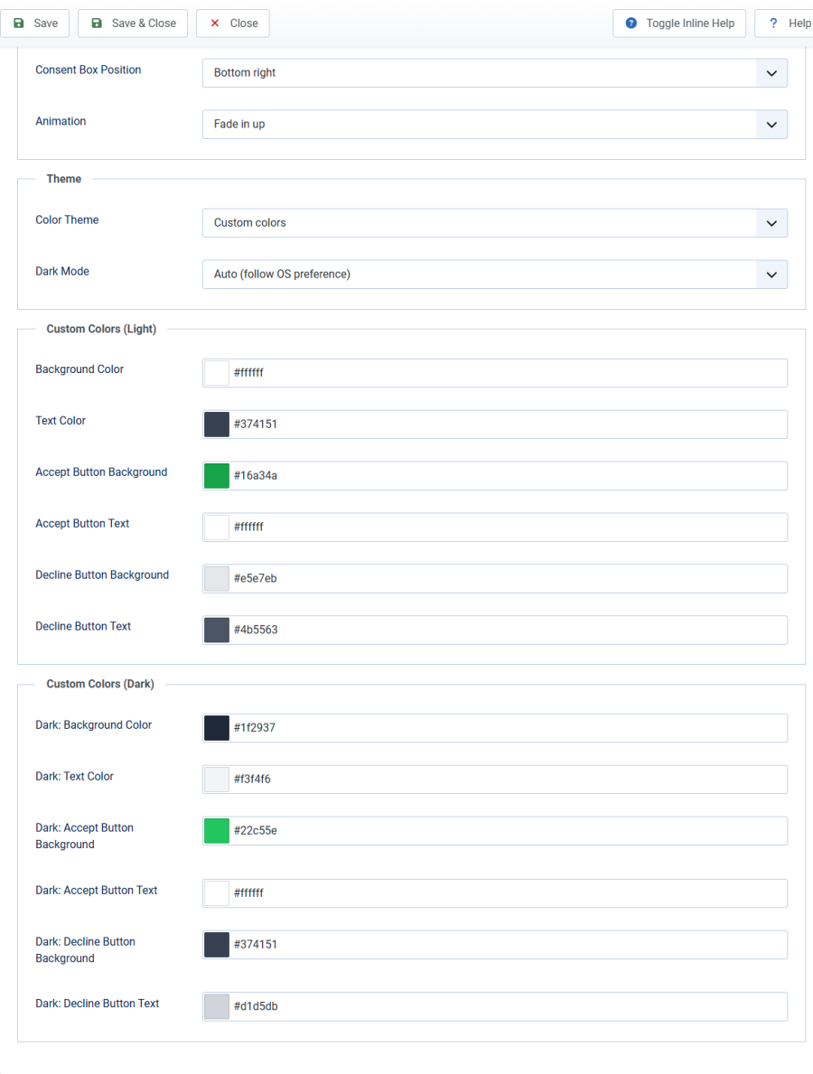
Layout
Consent Box Position
| Option | Value | Description |
|---|---|---|
| Center (modal) | 1 | Centered overlay with semi-transparent backdrop. Max width 500px. |
| Bottom bar (full width) | 2 | Full-width bar fixed to the bottom of the viewport. |
| Bottom right | 3 | Card fixed to the bottom-right corner. Max width 400px. |
| Bottom left | 4 | Card fixed to the bottom-left corner. Max width 400px. |
Default: Center (modal)
See Positions & Animations for visual details and responsive behavior.
Animation
| Option | Description |
|---|---|
| Fade in down | Slides in from above (default) |
| Fade in up | Slides in from below |
| Fade in left | Slides in from the left |
| Fade in right | Slides in from the right |
All animations respect the prefers-reduced-motion media query. When a visitor has reduced motion enabled in their OS, the consent box appears instantly without animation.
Theme
Color Theme
| Theme | Light Colors | Description |
|---|---|---|
| Clean | White background, green accept button | Neutral, works with any site (default) |
| Midnight | Navy background, amber accept button | Bold, high-contrast |
| Forest | Emerald tones, coral accept button | Natural, organic feel |
| Slate | Gray background, blue accept button | Professional, understated |
| Warm | Cream background, teal accept button | Friendly, approachable |
| Custom | Your colors | Full control via color pickers |
Each built-in theme includes a carefully crafted dark mode variant.
Dark Mode
| Option | Behavior |
|---|---|
| Auto (follow OS preference) | Uses the prefers-color-scheme media query to detect the visitor's OS setting. Switches between light and dark automatically. (default) |
| Always light | Forces the light variant regardless of OS preference. |
| Always dark | Forces the dark variant regardless of OS preference. |
Custom Colors
When Color Theme is set to Custom, 6 color picker fields appear for light mode:
| Field | Default | CSS Variable |
|---|---|---|
| Background Color | #ffffff |
--slga-bg |
| Text Color | #374151 |
--slga-text |
| Accept Button Background | #16a34a |
--slga-btn-agree-bg |
| Accept Button Text | #ffffff |
--slga-btn-agree-text |
| Decline Button Background | #e5e7eb |
--slga-btn-decline-bg |
| Decline Button Text | #4b5563 |
--slga-btn-decline-text |
When dark mode is set to Auto or Always dark, 6 additional color pickers appear for the dark variant:
| Field | Default | CSS Variable |
|---|---|---|
| Dark: Background Color | #1f2937 |
--slga-bg |
| Dark: Text Color | #f3f4f6 |
--slga-text |
| Dark: Accept Button Background | #22c55e |
--slga-btn-agree-bg |
| Dark: Accept Button Text | #ffffff |
--slga-btn-agree-text |
| Dark: Decline Button Background | #374151 |
--slga-btn-decline-bg |
| Dark: Decline Button Text | #d1d5db |
--slga-btn-decline-text |
Tip: The dark color pickers are hidden when dark mode is set to Always light, since the dark variant will never be displayed.