Themes & Dark Mode
The plugin ships with 5 built-in color themes plus a fully customizable option. Each theme includes light and dark variants.
Built-in Themes
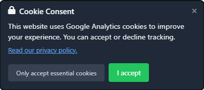
Clean (default)
A neutral, minimal design that works with any site.
- Light: White background, dark gray text, green accept button, light gray decline button
- Dark: Dark gray background, light text, bright green accept button, medium gray decline button
Midnight
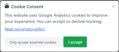
A bold, high-contrast design.
- Light: Navy/dark blue background, light text, amber/gold accept button
- Dark: Deeper navy background, brighter accent colors
Forest
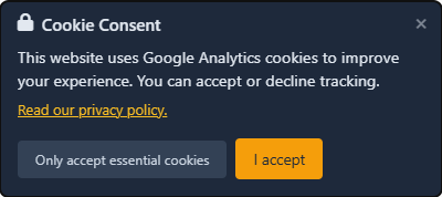
A natural, organic design.
- Light: Emerald green tones, coral/orange accept button
- Dark: Dark emerald background, warmer accent colors
Slate
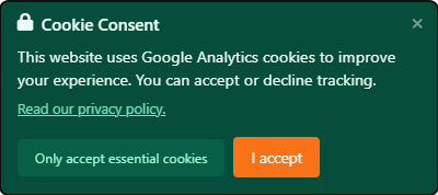
A professional, understated design.
- Light: Gray background, blue accept button
- Dark: Darker gray background, brighter blue accents
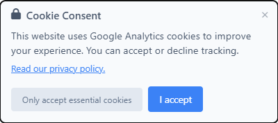
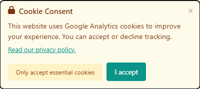
Warm
A friendly, approachable design.
- Light: Cream/warm white background, teal accept button
- Dark: Warm dark background, lighter teal accents
Custom Theme
Select Custom colors in the theme dropdown to define your own colors. The custom theme provides 12 color pickers — 6 for light mode and 6 for dark mode:
Light mode colors:
| Color | Controls | Default |
|---|---|---|
| Background | Consent box background | #ffffff |
| Text | All text in the consent box | #374151 |
| Accept Button Background | Accept button fill | #16a34a |
| Accept Button Text | Accept button label | #ffffff |
| Decline Button Background | Decline button fill | #e5e7eb |
| Decline Button Text | Decline button label | #4b5563 |
Dark mode colors (only shown when dark mode is Auto or Always dark):
| Color | Controls | Default |
|---|---|---|
| Dark: Background | Consent box background | #1f2937 |
| Dark: Text | All text | #f3f4f6 |
| Dark: Accept Button Background | Accept button fill | #22c55e |
| Dark: Accept Button Text | Accept button label | #ffffff |
| Dark: Decline Button Background | Decline button fill | #374151 |
| Dark: Decline Button Text | Decline button label | #d1d5db |
Custom colors are applied via CSS custom properties (variables), so they override the theme defaults cleanly.
Dark Mode Behavior
| Setting | Behavior |
|---|---|
| Auto | The consent box follows the visitor's OS/browser dark mode preference via the prefers-color-scheme CSS media query. If the OS is in dark mode, the dark variant is shown. |
| Always light | The light variant is always displayed, regardless of the visitor's OS settings. |
| Always dark | The dark variant is always displayed, regardless of the visitor's OS settings. |
How Auto Detection Works
The plugin uses CSS media queries — not JavaScript — to detect dark mode:
- Built-in themes define dark colors inside
@media (prefers-color-scheme: dark)blocks in the stylesheet - Custom themes use an inline
<style>block with the same media query - When dark mode is forced (Always light or Always dark), CSS classes (
slga-lightorslga-dark) override the media query
This approach is instant (no flash of wrong theme) and works even when JavaScript is disabled.