Custom Fields
Custom Fields let you add your own typed fields to items, warehouses, and recipients. Twelve field types, grouped into fieldsets, with per-field toggles for search and filtering — custom fields are the main way of shaping Next Inventory to your specific inventory needs.
Open it from Components > Next Inventory > Configuration > Custom Fields.
For Users
If someone else set up the custom fields, you encounter them on:
- Item, Warehouse, or Recipient edit forms — a Custom Fields panel at the bottom of the form, grouped by fieldset.
- List-view filters — fields marked filterable appear as filter options on the Items list, Transactions, and Reports.
- Search — fields marked searchable are included in search, so typing a value finds records with that value.
There's nothing to configure on the user side — the field types, labels, and defaults come from the definitions on this screen.
For Admins
This screen has two main views, accessible via sub-tabs:
- Field Definitions — the individual fields.
- Fieldsets — groupings that keep the admin form tidy.
Open a third view, Reorder, to drag-and-drop fields within a fieldset.
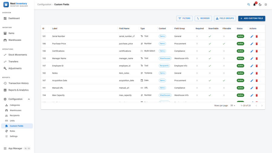
Fieldsets First
Before adding individual fields, create a fieldset to group them:
- Open the Fieldsets sub-tab → New.
- Enter a Title (shown as the panel header in edit forms), a machine-friendly Name (lowercase, underscores), and pick a Context (item, warehouse, or recipient).
- Optionally add a Description and an Ordering number.
- Save.
Fieldsets are optional — fields without a fieldset appear under a default "Additional Details" header — but grouping makes busy edit forms readable.
Defining a Field
- Open the Field Definitions sub-tab → New.
- Pick a Context (item / warehouse / recipient).
- Pick a Fieldset (or leave blank for the default group).
- Enter a user-facing Label ("Serial Number") and a machine Name ("serial_number" — lowercase letters, numbers, and underscores only).
- Optionally add a Description (tooltip helptext).
- Pick a Field Type:
- Text, Textarea, Number, Select (Dropdown), Checkbox, Date, Radio Buttons, Email, URL, Color Picker, File Upload, Multi-Select
- Set a Default Value if applicable.
- Tick the toggles:
- Required — the field must be filled in before saving.
- Searchable — the field's values can be found via search.
- Filterable — appears as a filter control on list views.
- Set an Ordering number (lower = earlier).
- For Select, Multi-Select, and Radio types, fill in the Options tab with one option per line.
- Save.
Searchable and Filterable
Two toggles control how a field behaves on list screens:
- Searchable — lets you find records by the field's value: typing a value into the search box matches against it.
- Filterable — adds the field as a filter option on list views, alongside the built-in filters.
Reserve these for the handful of fields you genuinely search or filter by. Every extra searchable or filterable field adds a little overhead to the list screens, so most fields are best left with both toggles off — their values still display everywhere; they just don't take part in search and filtering.
Field Types and Their Behaviours
- Text / Textarea — single-line or multi-line text; any risky HTML is stripped on save.
- Number — numeric values, decimals allowed.
- Select / Radio — one value chosen from the Options list.
- Multiselect — several values chosen from the Options list.
- Checkbox — a simple yes/no tick.
- Date — a date picked from a calendar.
- Email — an email address, checked for valid syntax.
- URL — a web address, checked for a valid shape.
- Color — hex colour picker (
#ABCDEF). - File — an uploaded file, handled by the same upload pipeline as item images (see Settings → Images).
Reordering Fields
The Reorder page is a drag-and-drop list per fieldset. Drag to reorder, release to save — the new order applies immediately.
Permissions
| Action | Feature | Permission |
|---|---|---|
| See custom fields in admin | configuration |
manage_custom_fields |
| Create or edit a field / fieldset | configuration |
manage_custom_fields |
| See field values on items / warehouses / recipients | inherits | item / warehouse / recipient view |
| Filter lists by searchable fields | inherits list-view permissions | — |
Edge Cases
- Renaming a field's Name after it has values — existing data stays stored under the old name and no longer appears on the form. Avoid renames; create a new field and re-enter the data manually if you must.
- Changing a field's Type — not recommended. The existing stored value may not convert cleanly (e.g. text → number when the text isn't numeric). If you must, export values first, recreate the field with the new type, and re-import.
- Ticking or unticking Searchable on a field that has values — the change applies to values saved from then on, but existing records don't update automatically. Re-save affected records so search and filters pick them up.
- Select / Multiselect with hundreds of options — very long option lists are slow to render on the edit form. For taxonomies of that size, consider splitting into several smaller fields, or ask your developer about a small component customisation.
- File field storage — uploaded files live alongside item images and follow the same Image settings: upload folder, allowed formats, and maximum file size.
Form Reference
Fieldset
| Field | Required | What it's for |
|---|---|---|
| Title | yes | The panel header shown on edit forms |
| Name | yes | Internal name (lowercase, underscores) |
| Context | yes | Where the fieldset appears: item, warehouse, or recipient |
| Description | no | Optional note on the fieldset's purpose |
| Ordering | no | Display order within the context (lower = earlier) |
| Status | yes | Published / Unpublished |
Field
| Field | Required | What it's for |
|---|---|---|
| Context | yes | Where the field appears: item, warehouse, or recipient |
| Fieldset | no | Parent fieldset (blank = default group) |
| Label | yes | The label users see on forms |
| Name | yes | Internal name (lowercase, underscores) |
| Description | no | Helptext tooltip shown with the field |
| Field Type | yes | One of the 12 types listed above |
| Default Value | no | Value pre-filled for new records |
| Required | no | The field must be filled in before saving |
| Searchable | no | Lets search find records by this field's value |
| Filterable | no | Adds the field as a filter on list views |
| Ordering | no | Display order within the fieldset |
| Options | conditional | The choices offered — required for Select, Multi-Select, and Radio |
| Status | yes | Published / Unpublished |